Steam Redesign
Steam is one of the most iconic digital gaming platforms, with a long-standing history and a massive global user base. However, despite its success, Steam’s user interface has started to show its age. Navigating the site can feel overwhelming, and finding specific games or features often becomes a frustrating experience. Many players—myself included—have found themselves thinking: Why is this still so hard to use?
This case study focuses on identifying the core pain points within Steam’s current e-commerce experience and proposing a redesign that better aligns with the expectations of modern gamers. In addition to the UX challenges, this was also a collaborative school project, which gave us the opportunity to explore how to work effectively as a design team—balancing communication, planning, and execution throughout the process.
As the Design Lead, I was responsible for overseeing the timeline, assigning tasks, and ensuring quality across all deliverables. Since every member of the team was a fellow design student, I also actively participated in every phase of the project—from setting goals and conducting user interviews to defining key improvement areas and crafting the final design, including the style guide.
Tools
Figma
Photoshop
Role
Design Lead
Combines UX and UI works to ensure both the experience and interface are cohesive, functional, and user-friendly.
Timeline
Overall: 2+ weeks
Discovery & Research: 1 weeks
Ideate, Design & Testing: 1 weeks
Steam Redesign
Team Work
Sena, Rodolfo, Rosie, Grace
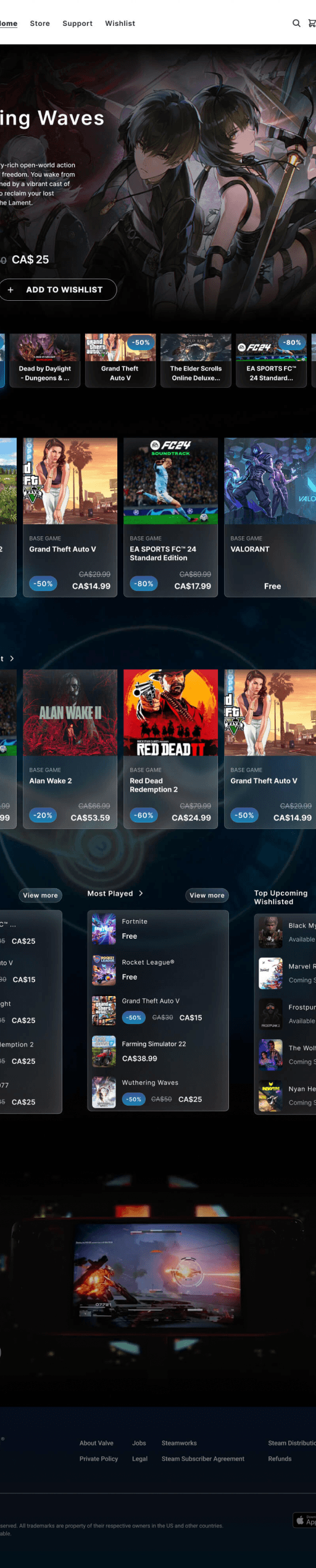
Home
Page
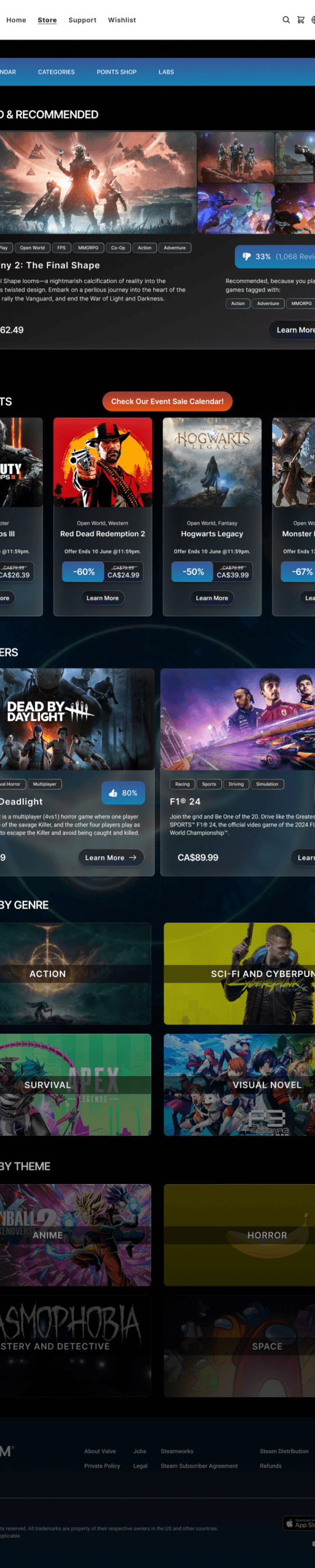
Store
Page
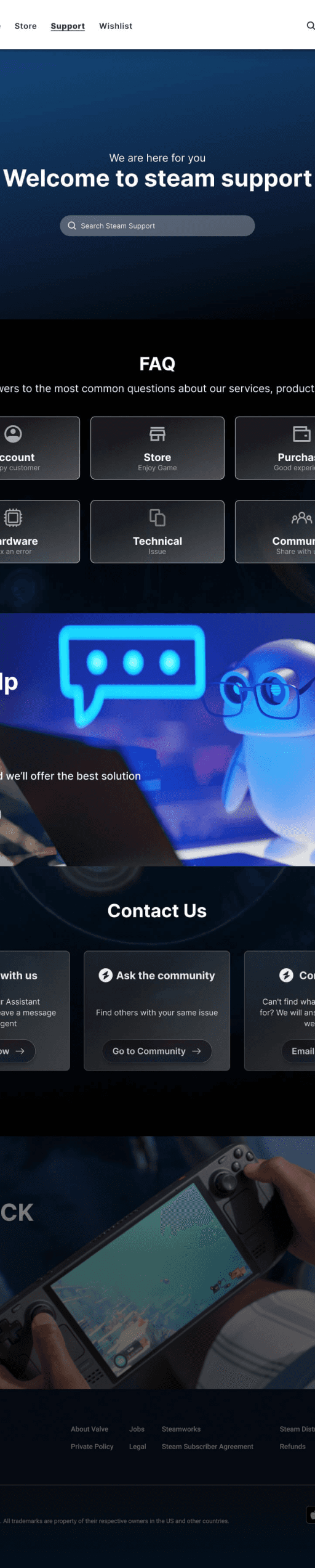
Support
Page
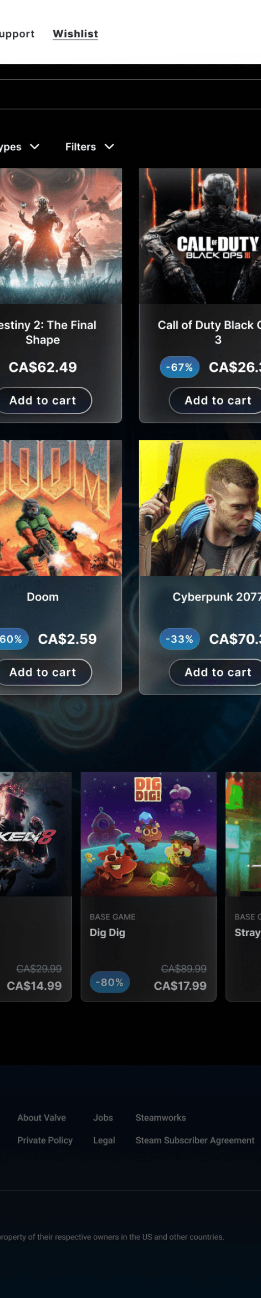
Wishlist
Page
Design Process
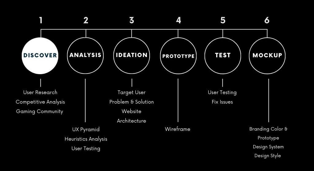
Research
Strategy
Design
Phase 1: Discovery and research
Why- What is the goal?
Attract New Users:
With growing competition in the digital gaming space, our goal is to redesign the website based on user feedback to attract a wider audience and create a more engaging first-time experience.
Improve User Retention:
Beyond gaining new users, we aim to leave a lasting positive impression that encourages repeat visits, builds loyalty, and increases word-of-mouth recommendations.
Who- Are you designing for?
New Game Buyers:
First-time users who are unfamiliar with the Steam platform. They may feel overwhelmed by the dense layout and unclear product hierarchy, needing a smoother onboarding experience and intuitive navigation.
Experienced Players:
Long-time users who rely on Steam not just for purchases, but for community, content discovery, and game management. While they know the platform well, they’re frustrated by outdated design patterns, inefficient search, and missing features like personalized recommendations or clearer promotions.
🌐 Context
Redesigning Steam was a unique and exciting group design challenge. As one of the most iconic digital game distribution platforms, Steam has been around for decades—but its user interface hasn’t seen a significant update since 2017. As a result, many of its design patterns no longer align with the expectations and habits of today’s players.
Our goal was to identify these outdated pain points and reimagine the Steam experience through a more modern lens—both visually and functionally. This included creating a cleaner, more intuitive UI, improving the search experience, and organizing games into easy-to-understand categories. By doing so, we aimed to make the platform more approachable for new users, while still serving the needs of long-time players.
🔍 Finding the problem
To begin the redesign process, I stepped away from my role as a designer and walked into the experience as a user. By navigating the platform through their eyes—click by click, hesitation by hesitation—I began to uncover subtle frustrations and friction points that weren’t immediately visible on the surface. This empathy-first approach allowed me to observe not just what users were doing, but why they were doing it—or, in some cases, why they were giving up altogether. Whether it was a confusing navigation structure, an overwhelming interface, or missing feedback at key interaction points, I made it my mission to translate these pain points into actionable insights. This mindset shift—from creator to experiencer—was the foundation for identifying the real problems worth solving.
🎯 Business Goals
💰 Sell as many games as possible—indie to AAA.
🏆 Stay the top platform despite rising competition (like Epic Games Store).
🕹️ Features like achievements, friends list, Steam Workshop, and game mods keep users coming back.
💼 Encourage more devs to publish on Steam and stay loyal to the platform.
🚀 Be the ultimate ecosystem for PC and cross-platform gaming.
🧑💬 User Interview
To design a more intuitive and engaging experience for Steam users, we began by conducting user interviews to better understand our audience’s behaviors, frustrations, and unmet needs. These conversations provided crucial insights into how people interact with the current platform—and more importantly, why they might choose not to return.
By analyzing the feedback, we were able to identify common patterns and pain points, helping us define clearer UX priorities. This human-centered approach ensured that our redesign would go beyond assumptions and directly address real user expectations and behaviors.
🎯 Key Observations from Stakeholder Insights:
• Retention is a concern: Many users visit Steam once, but don’t return—suggesting the current UI and discovery features lack lasting engagement.
• Feature gaps: Users often express a desire for features that aren’t currently available, indicating opportunities for added functionality.
• Demographic shift needed: While the existing user base tends to skew older, there is a strong business goal to attract and retain a younger generation of gamers.
N.T
Age 24–25, Experienced Gamer:
Main frustration: Steam lacks visual appeal, intelligent recommendations, and efficient browsing compared to competitors like GoG.
R.Q
Age 50, Casual User / First-Time Visitor:
• Thought the site looked good at first but didn’t understand what it was about.
• Missed that they could scroll—hero section was misleading.
• Navigation didn’t follow the user, making it hard to explore.
• Community section was cluttered and confusing.
• Pop-up posts weren’t responsive—got cut off.
• “Back to top” button was barely noticeable.
• Didn’t understand what “Hubs” were—wanted clearer categories.
• “About Us” disappeared after login.
• “Install Steam” felt spammy; wanted contact info.
• Support pushed login; couldn’t find FAQ or help easily.
👤 User Persona

Nut
Junior Software Developer
24
Vancouver, BC
🙎 Bio:
Favourite Genres: RPGs, Strategy, Indie Games
Nut is a passionate young adult gamer who spends most of his free time exploring immersive PC and console titles. With a massive personal game library on Steam, he has deep experience navigating the platform—but that also means he’s more critical of its shortcomings. Though he doesn’t care much for mobile games, he enjoys watching game livestreams on YouTube and discovering new indie releases. His experience makes him highly attuned to what works—and what frustrates—in the gaming ecosystem.
😫 Pain Points:
• Visual Design Feels Outdated: Compared to competitors like GoG, Steam feels less visually appealing and intuitive.
• Search-Only Discovery: It’s hard to explore casually; users must search with very specific keywords to find games.
• Lack of Personalized Recommendations: Nut hasn’t noticed any meaningful suggestions based on his purchase history or profile—which could mean the system is lacking or poorly communicated.
• Playable vs. Unavailable Games Not Separated: Games that aren’t currently available look the same as playable ones—leading to disappointment during checkout.
• No Dedicated Discount Section: Without a clear promotions page, he often misses out on deals unless he’s searching for a specific title.
😉 Needs:
1. Efficient Game Discovery
→ Nut needs a more intuitive way to find games he might enjoy—without relying on perfect keywords or knowing exact titles in advance.
2. Personalized Recommendations
→ He wants Steam to feel smarter and more tailored to his preferences, offering game suggestions based on his library, genres, and playing habits.
3. Clear Product Availability
→ He needs to quickly distinguish between games that are available to play and those that are not—without wasting time clicking through.
4. Easy Access to Discounts
→ Nut wants a clearly labeled section to browse ongoing deals, promotions, and seasonal sales without having to search manually.
5. Modern, Engaging Visual Design
→ As a visually driven user, he expects a polished and aesthetically pleasing UI that matches the standards of modern e-commerce and entertainment platforms.
6. Transparency in Features
→ If personalization or helpful systems exist, Nut wants them to be clearly communicated and easy to access, so nothing useful stays hidden.
🧭 Industry Leaders Analysis
Conducting an industry analysis was a key step in understanding the competitive landscape, current trends, and user expectations in the digital game distribution space. This process helped us identify both best practices and common pitfalls across major platforms—allowing us to design a more user-centered and future-ready solution.
By comparing Steam, Epic Games Store, and GOG.com, we evaluated how each platform handles game discovery, user engagement, interface design, and community integration. Understanding their strengths and weaknesses helped us uncover opportunities for improvement and innovation in Steam’s redesign—especially in areas like navigation, personalization, and visual hierarchy.

About Steam
Steam is a video game digital distribution service and storefront managed by Valve. It was launched as a software client in September 2003 to provide game updates automatically for Valve's games, and expanded to distributing third-party titles in late 2005.
Observations & Key Features
Key Features
Game purchase
Community forums
Social networking
Design update
Layout
The interface is cluttered due to its densely packed layout, which includes numerous sections that contribute to a less user-friendly experience.
Market Position
-Dominant in the digital distribution platform market
-With a large user base and vast library of games.
UX Design
The platform has strong community features, but the complexity of its user interface can be overwhelming and difficult to navigate for some users.

About Company
Epic Games, Inc. is an American video game and software developer and publisher based in Cary, North Carolina. The company was founded by Tim Sweeney as Potomac Computer Systems in 1991, originally located in his parents' house in Potomac, Maryland.
Observations & Key Features
Key Features
Intuitive experience
Modern design
Game developer
Layout
The design is sleek and modern, with a strong focus on showcasing Blizzard's iconic games, highlighting their unique aesthetics and rich histories.
Market Position
-Growing user base
-Known for exclusive game deals and competitive revenue sharing for developers
UX Design
The platform offers a smooth and intuitive experience, providing easy access to games and social features, enhancing overall user engagement and satisfaction.

About Company
GOG.com is a digital distribution platform for video games and films. It is operated by GOG sp. z o.o., a wholly owned subsidiary of CD Projekt based in Warsaw, Poland. GOG.com delivers DRM-free video games through its digital platform for Microsoft Windows, macOS and Linux.
Observations & Key Features
Key Features
DRM-free games
Classic titles
Retro gaming
Layout
The design is clean and retro-inspired, with a strong focus on DRM-free classic games, appealing to nostalgic gamers and collectors alike.
Market Position
-The Niche platform caters to fans of classic and indie games
-is known for its commitment to preserving gaming history.
UX Design
The platform provides a user-friendly experience with a straightforward interface, allowing easy access to classic games and enhancing overall usability.
Research
Strategy
Design
Phase 2: Strategy & Problem Definition
How might we solve the
pain points?
Through user interviews, feedback analysis, and industry benchmarking, we identified several critical areas of improvement across the Steam platform:
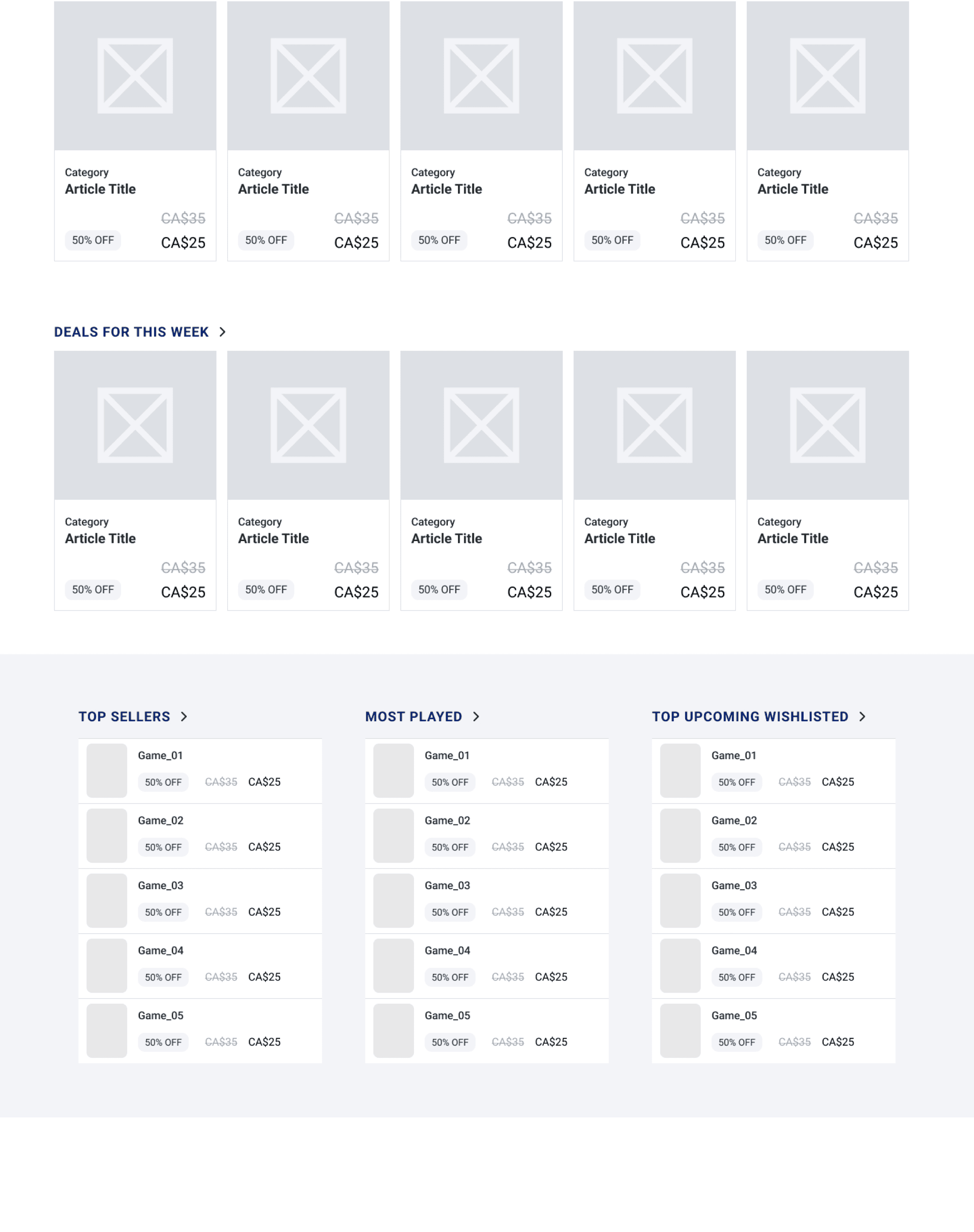
🏠 1. Home Page
• Users struggle with complex navigation and weak visibility of key content.
• Notifications go unnoticed, and promoted games lack impact.
• There is little real-time engagement or interactive community presence.
🛒 Shop Page
• Search is frustrating and limited, especially for users unsure of exact game titles.
• The layout is overwhelming, with too much information presented at once.
• Steam has a reputation for poor customer support, which affects trust.
💖 3. Wishlist Page
• Managing and organizing wishlist items is unintuitive and lacks flexibility.
• Users expect more control and visual clarity over their saved content.
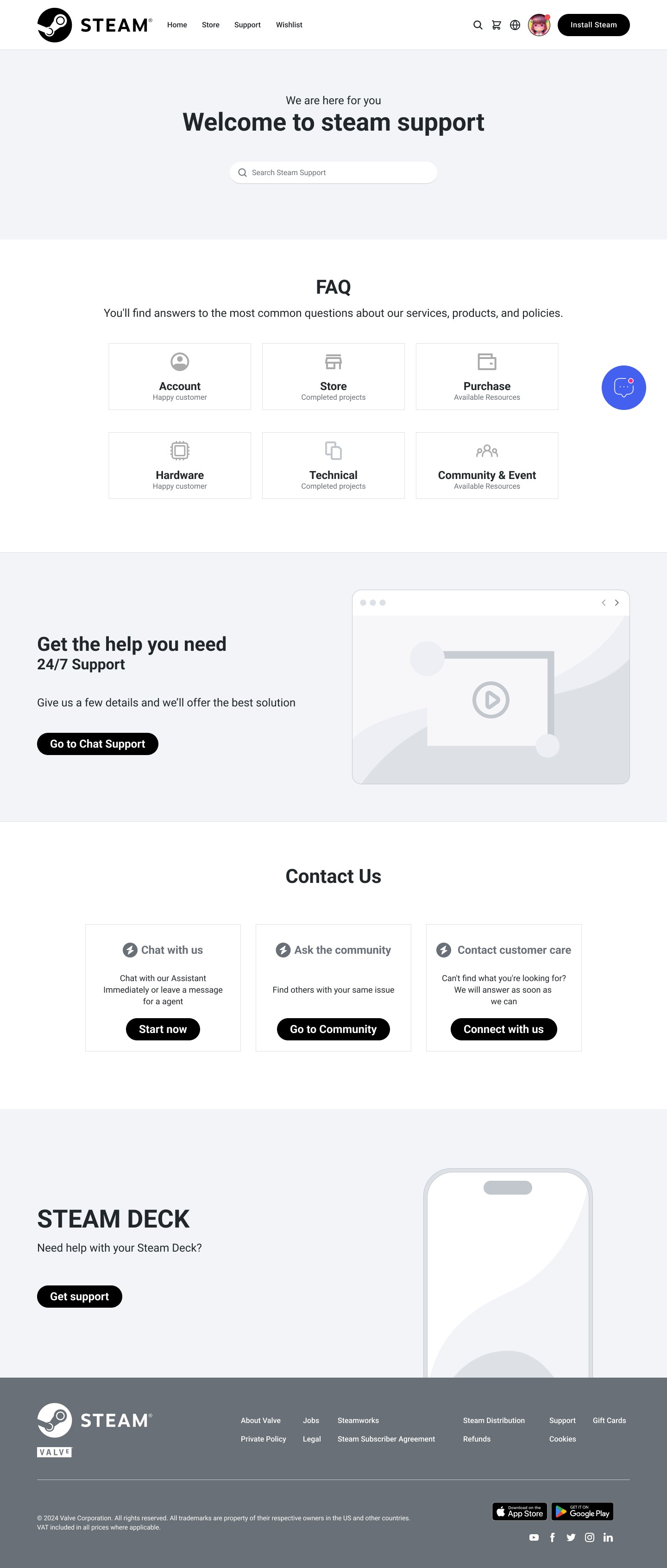
🛎️ 4. Support / Service Page
Problems Identified:
• The search bar is hidden, and support content is buried.
• Users are forced to log in for basic help, creating unnecessary friction.
• Community hubs are hard to navigate and poorly explained.
• There’s no chatbot or easy-access support system.
What features can we design/ build?
To address these pain points, we focused on designing specific, impactful features across four key pages:
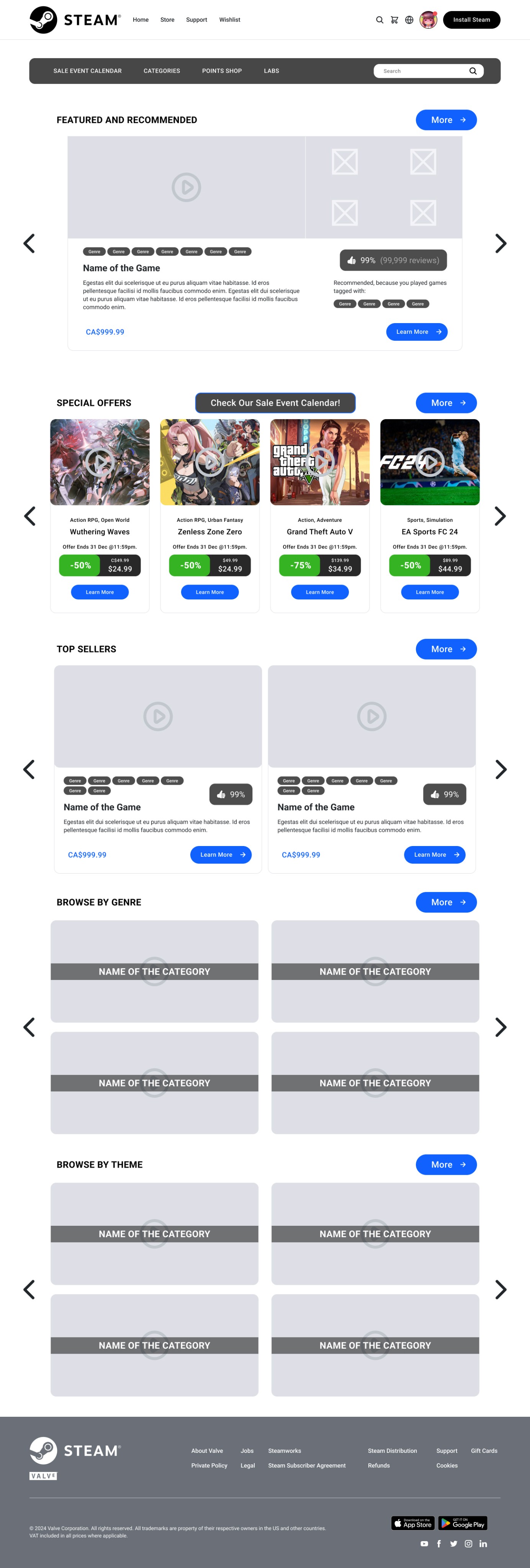
🏠 Home Page
• A simplified and reorganized navigation bar for faster access.
• Enhanced notification icons with visual priority.
• A hero section showcasing promoted games clearly and attractively.
• A built-in live chat room to foster real-time community interaction.
🛒 Shop Page
• An upgraded search experience with predictive text and filter refinements.
• A cleaner, more focused layout with visual hierarchy.
• Integration of a chat support feature for instant help and reassurance.
💖 Wishlist Page
• A drag-and-drop wishlist interface with sorting and tagging.
• Clearer add/remove controls and visual feedback.
• Direct access to chat support for wishlist-related questions or issues.
🛎️ Support / Service Page
• Relocated search bar at the top of the page for visibility.
• A curated and easy-to-navigate FAQ section.
• An integrated chatbot for immediate support.
• Reworked community hub structure with keyword search and interest-based recommendations.
✅ Developing the strategy: Solving the Problem
Our strategy focused on enhancing user experience by solving major usability issues found during interviews and analysis. The redesigned experience aims to support the following goals:
1. Help Users Discover Games Within 20 Seconds
Redesign the navigation bar and homepage layout to help users find games they’re interested in quickly—whether through search, personalized recommendations, or curated categories.
➡️ Business Impact: Reduces bounce rate by improving first-time experience and discoverability.
2. Encourage Quick Engagement (Add to Cart/Favorite)
Streamline game discovery by making key actions (like “Add to Cart” or “Add to Wishlist”) more accessible and immediate during browsing.
➡️ Business Impact: Increases conversion rate and keeps users actively interacting with content.
3. Improve Trust & Retention Through Support and Personalization
Address Steam’s poor support reputation by integrating easy-access help options (chatbot, FAQ) and offer smarter game recommendations based on user history and interests.
➡️ Business Impact: Builds trust, reduces user frustration, and encourages long-term platform loyalty.
Research
Strategy
Design
Phase 3: Design & Ideation
✍️ Explore, sketch, wireframe,
Have fun!
💭 Do a mini brainstorming session.
⛳ Start drafting your user journeys,
CJMs.
📊 If useful, create a task model.
⛳ User Journey Map
•
Overwhelming layout
•
Unclear promotions
•
Arrives on Steam’s homepage.
•
Browses to explore more games
•
Adds a few games to wishlist for later
•
Clean, organized homepage with visible promoted games in the hero section.
•
Navigation bar is simplified with clear game categories and genre filters.
•
Search is limited and overwhelming info overload.
•
Search bar with predictive typing and filters by genre, popularity, and discount
•
Visual hierarchy to highlight game cards clearly
•
Wishlist is messy, hard to organize
•
ort by price, release date, or genre.
•
Visual cues for discounts or restocks.
•
Direct share option or reminders when games go on sale
•
Support is hard to access without logging in
•
Wants to ask a question about download size or compatibility
•
FAQ section is visible and categorized.
•
Chatbot available for quick answers
•
“Search help” bar at the top of the support page
Seeking Support
Adding to Wishlist
Landing on the Homepage
Browsing the Shop
Happy
User Action
Neutral
Unhappy
Current Pain Point
Redesign Improvement
Wireframe
Usability Testing by Users
We created a fully-functional, high-fidelity prototype of the new flows using Figma. At the same time, we started recruiting subjects for the test who fit our criteria. We conducted 7 usability tests in the first round and 3 after iterating on the issues that we’ve identified.
Steam Redesign users interviews report
June 2024
7 interviews were conducted:
4 pro gamers,
3 casual players
Yuyu
Nanhee
Max
Carlos
Aim
Nut
Javier
Main insights
Positive aspects
The store looks good because it feels familiar to users.
The sales event calendar is easier to find.
The interface, looks less cluttered.
Having the original price and the discounted price is very good and important for a store so you keep customers.
The sharing function can share a Wishlist game with friends.
Expandable Info Pop-Up: Allow users to click on a game card to expand it, revealing a detailed description, screenshots, and trailers.
The layout of the chatbot is appealing, and having the option to choose questions directly is a good idea.
separate "hame" and "store" is a good idea. For me, "home" is like recommending the most popular games when I just want to relax and don't want to explore too much. "Store" is like I have a lot of time and I want to explore different categories.
Obstacles
It doesn’t spot a difference between the home page and the store page.
Comment Section: Include a comment section under each game card where friends can leave feedback or suggestions.
Integrated Reviews: Display a few top user reviews directly on the expanded view of the game card.
I use the mobile app more than the website so maybe on the home page, there should be more of an incentive for people to download the app itself.
Things to improve
The wording of some of the categories can be improved
Bulk Actions: Checkbox Selection: Add checkboxes in the top-left corner of each game card to enable multi-select.
The "home page" recommended games' names are better different from the "store". If you can change the "Featured product" to "The most popular" it will make more sense to me.
Design System
A UI design system is a comprehensive collection of reusable components, guidelines, and standards that ensure consistency, efficiency, and a cohesive visual language across a digital product's user interface.
Typography: Inter
Heading 1 - 60 Semibold
Heading 2 - 50 Semibold
Heading 3 - 40 Semibold
Heading 4 - 30 Semibold
Heading 5 - 24 Semibold
Headline - 20 Regular
Headline - 20 Medium
Body Large - 18 Regular
Body Large - 18 Medium
Body - 16 Regular
Body - 16 Medium
Footnote - 14 Regular
Footnote - 14 Medium
Caption - 13 Regular
Caption - 13 Medium
Small - 12 Regular
Small - 12 Medium
Conclusion:
We have solved most of the pain points of users. Most users like our UI design and are amazed by our new features such as chat room and design style. Most players agree with our distinction between "Home page" and "Store page" Because they serve different target users respectively.
Thank you for reading the Steam Redesign Project
Want to work with me? Feel free to contact me!
...or just say hello on my Linkedin😄